The Challenge
The main challenge was making wine feel accessible and easy to understand. Wine can often come across as complex or intimidating, so the design had to break down information into digestible pieces, use plain language, and create a calm, welcoming experience. The platform needed to build trust and curiosity, helping users feel more confident about wine without overwhelming them.
Design Approach
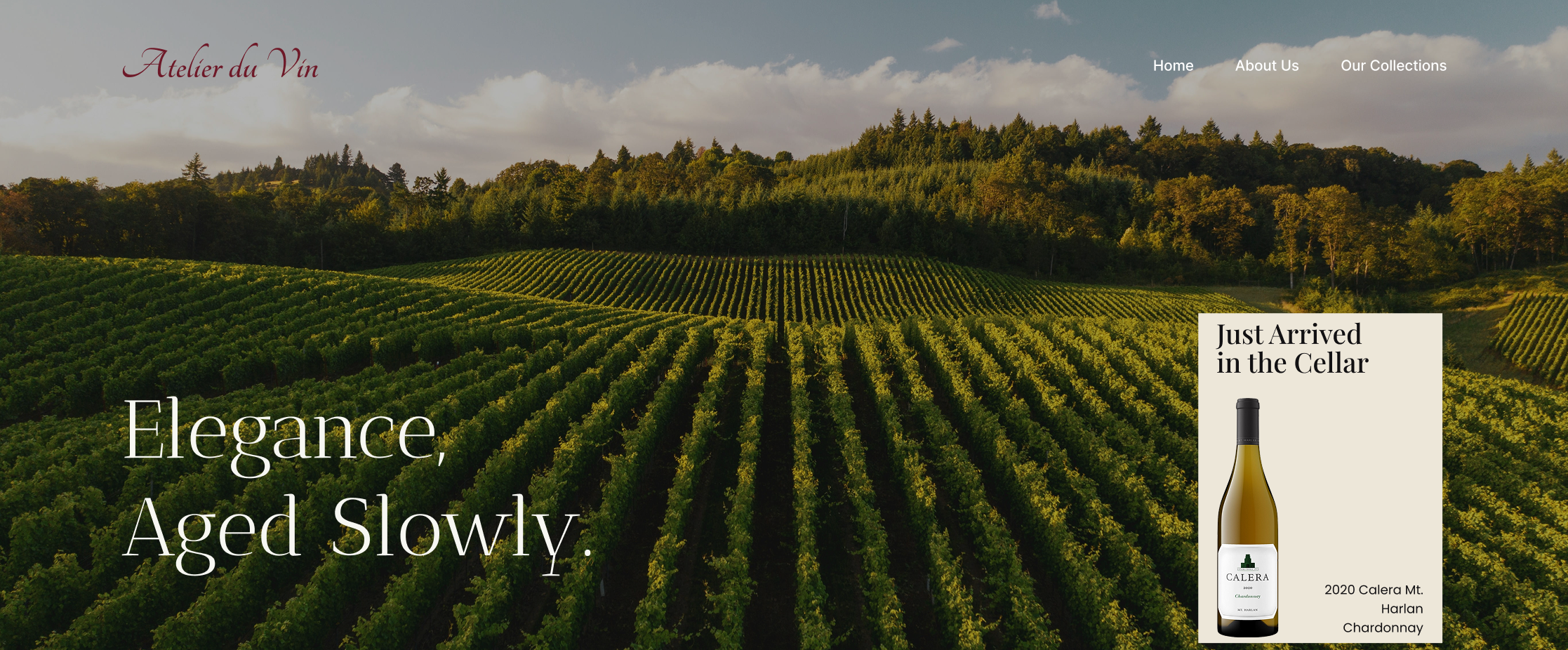
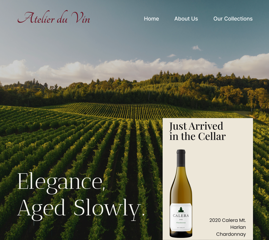
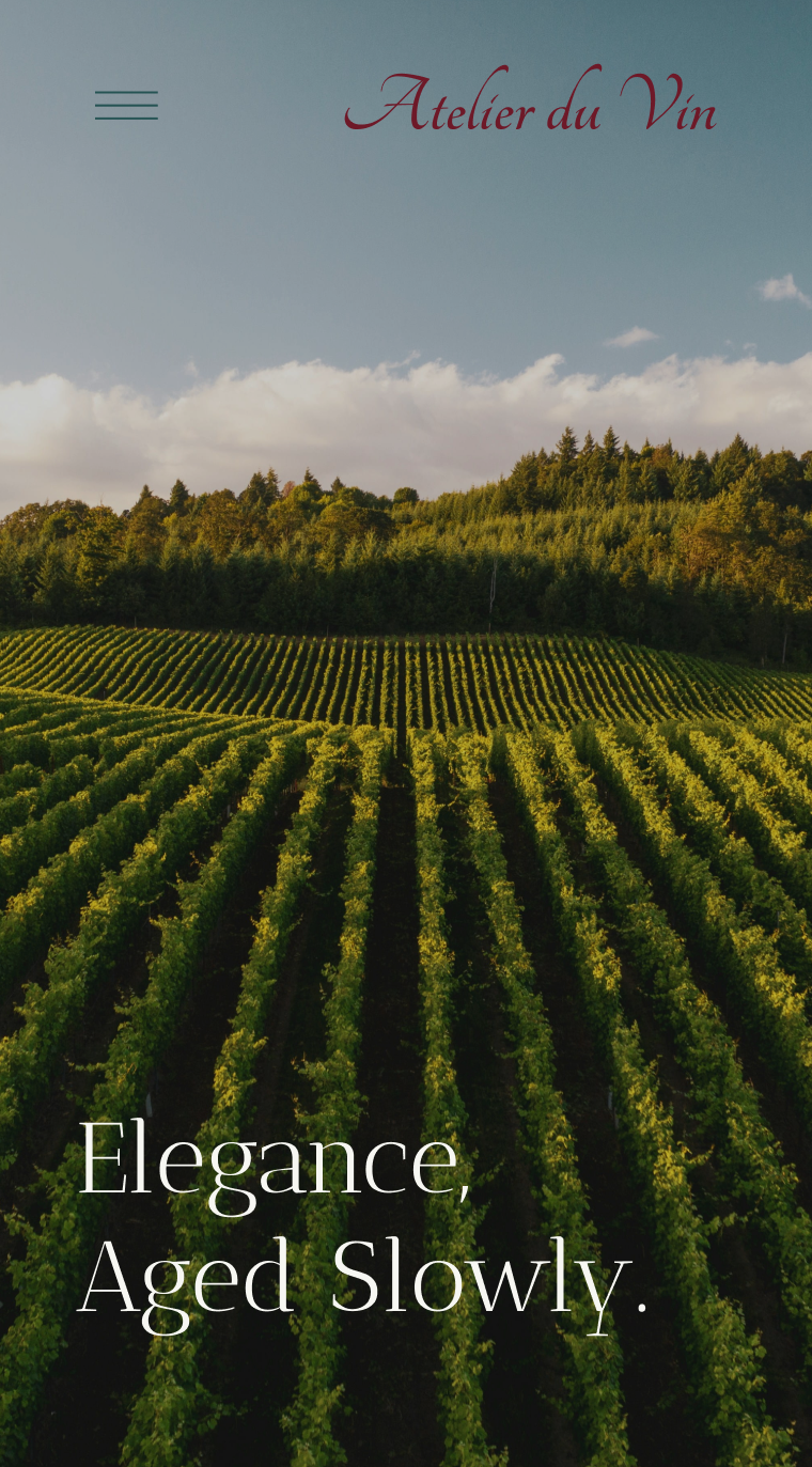
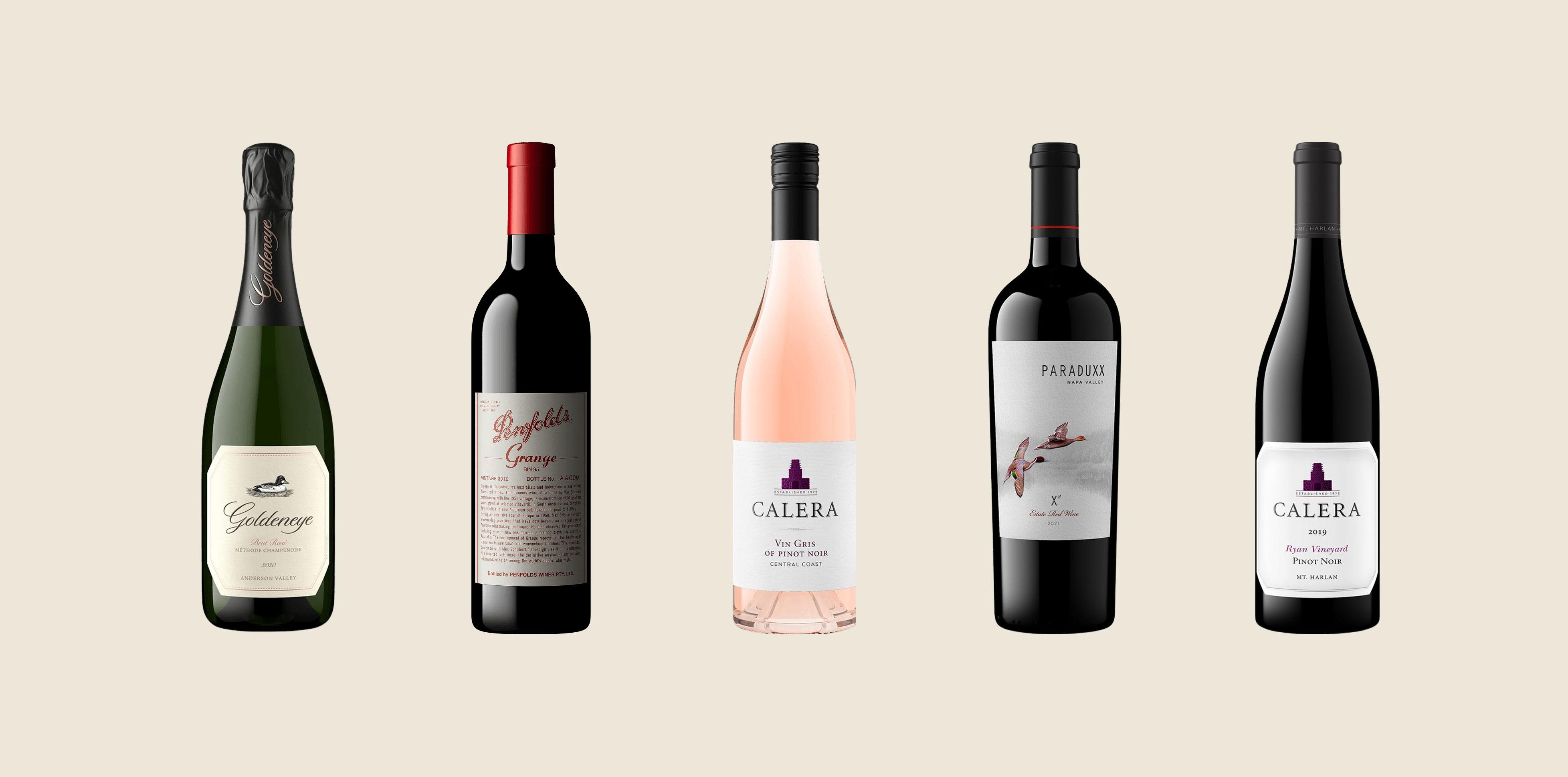
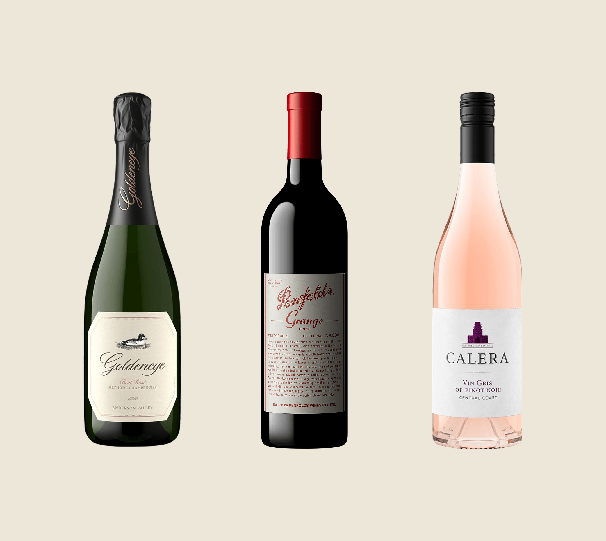
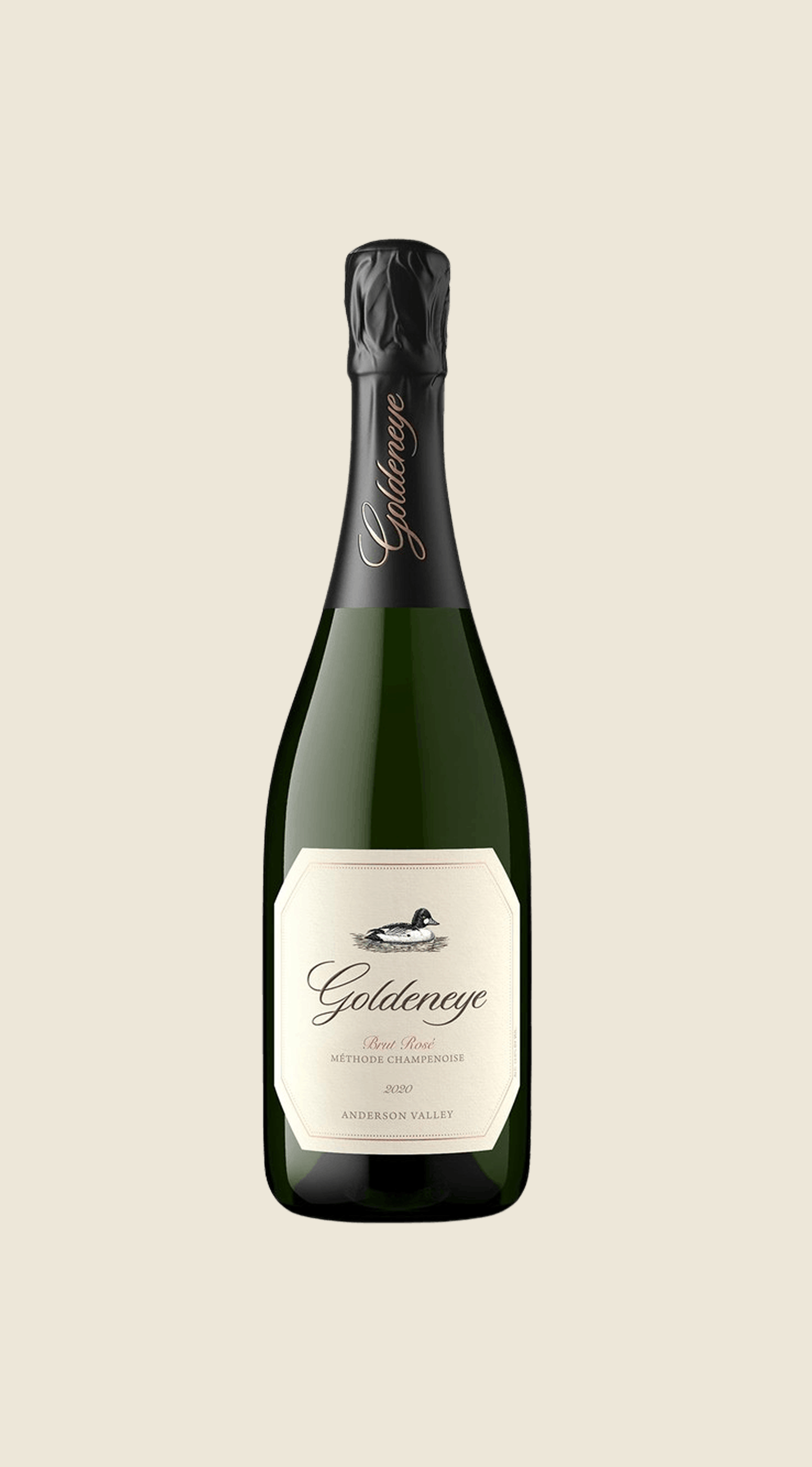
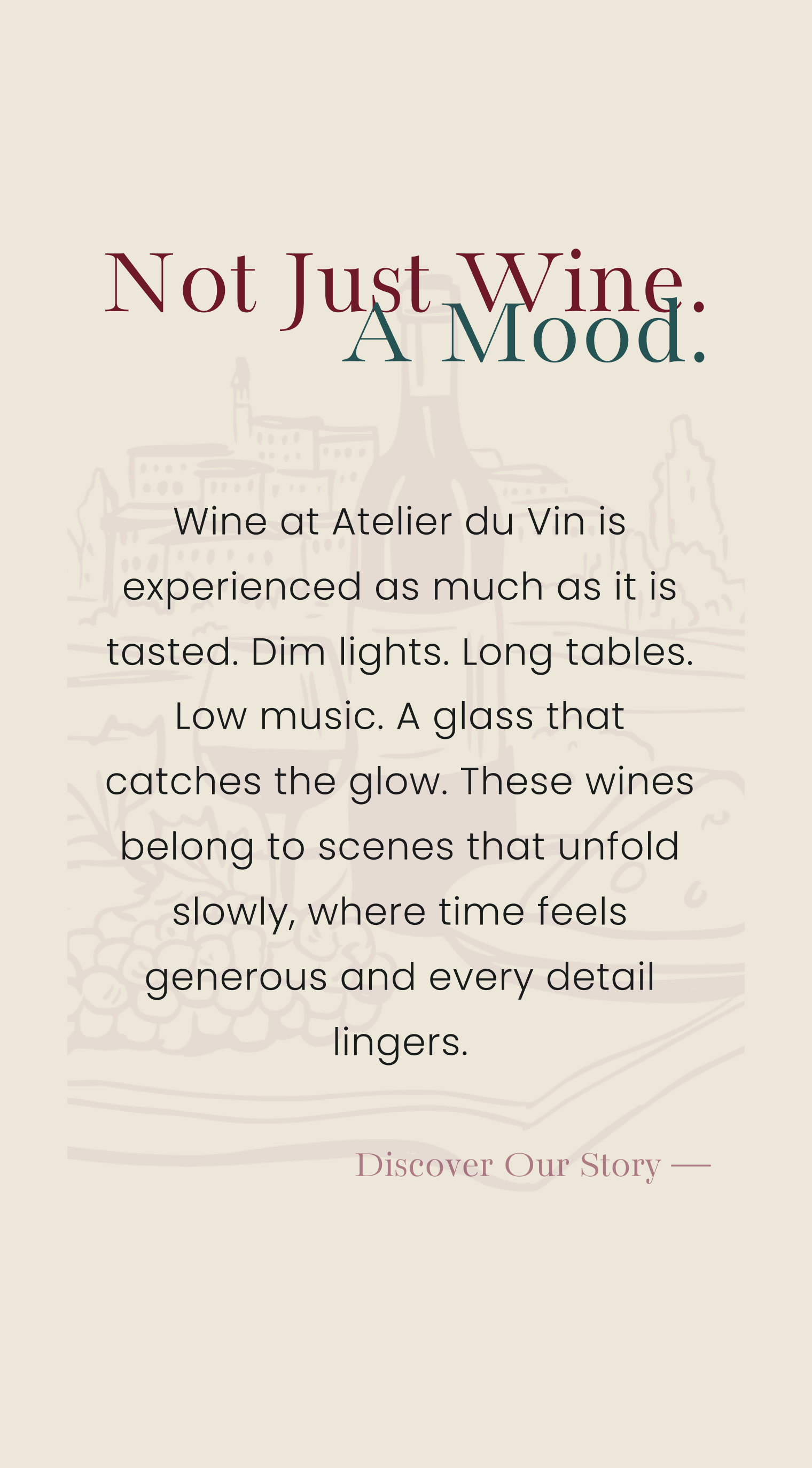
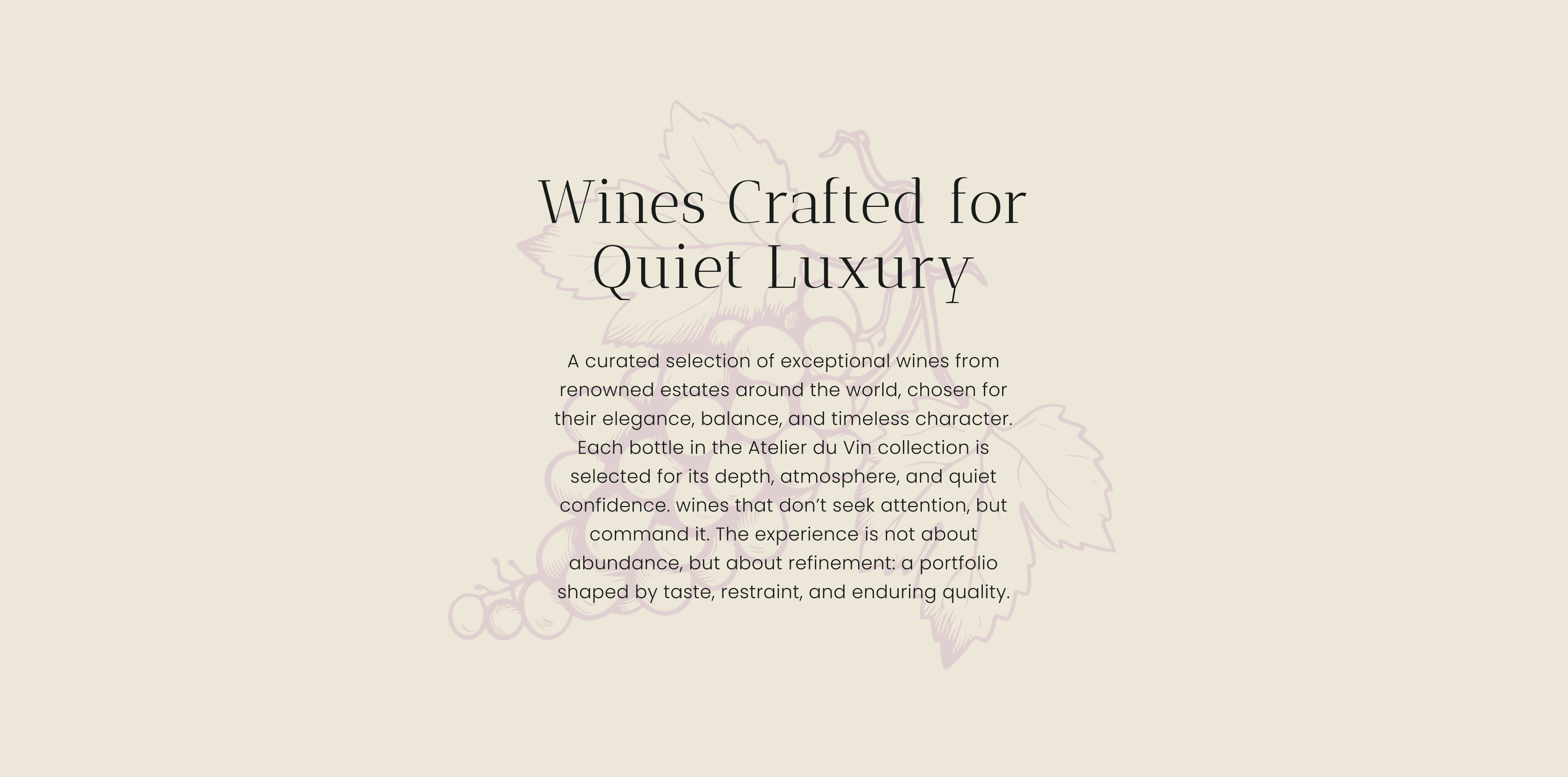
I started by mapping out how a beginner might want to explore wine—by grape type, or by region. The visual direction leaned warm and earthy, using soft burgundy, cream, and muted green to feel inviting rather than fancy. I used a clean card-based layout for different wine profiles, added simple navigation, and included short, friendly descriptions throughout.
The Outcome
The final result is a modern wine discovery platform that positions the brand as a trustworthy and approachable guide into the world of wine. The project successfully combines clean functionality with a warm visual identity, creating a digital experience that feels both professional and welcoming.